Jake Friend
Jake Friend
Creative Director & Designer

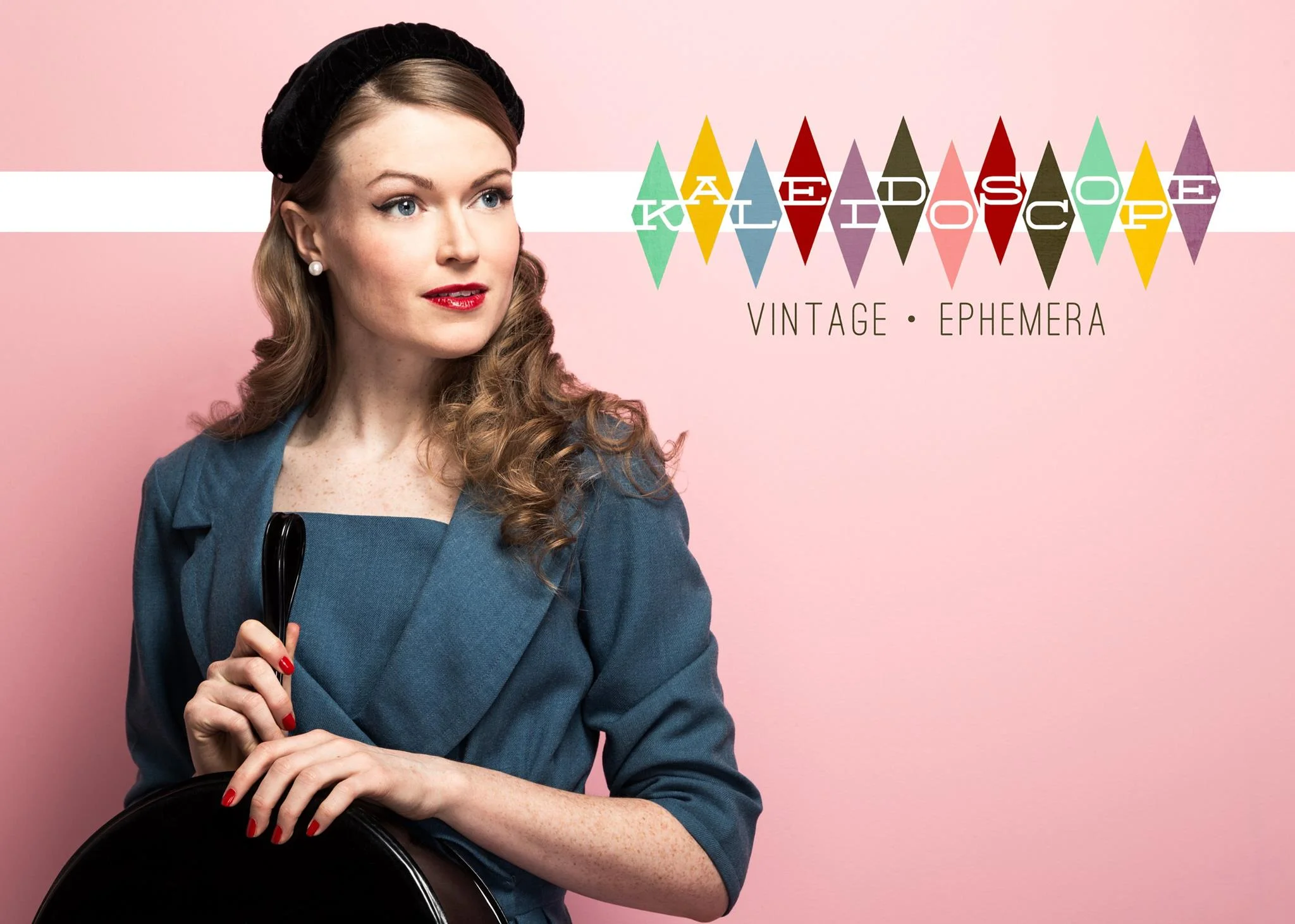
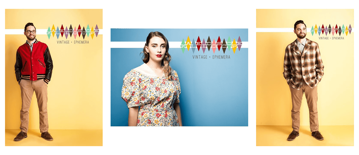
To accompany this transition, they asked for a completely new logo and visual identity. Something bright, cheerful, and comfy.
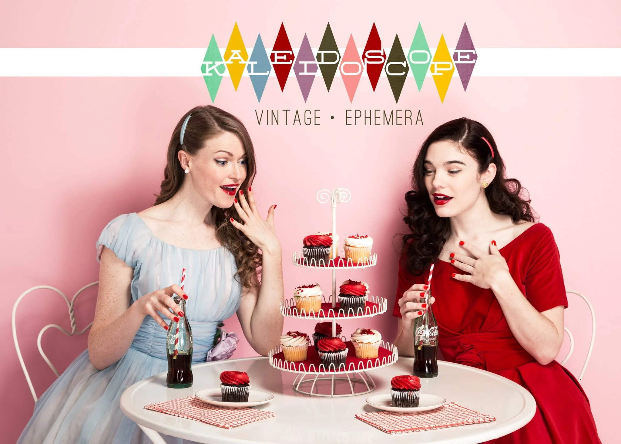
 To accompany this transition, they asked for a completely new logo and visual identity. Something bright, cheerful, and comfy.

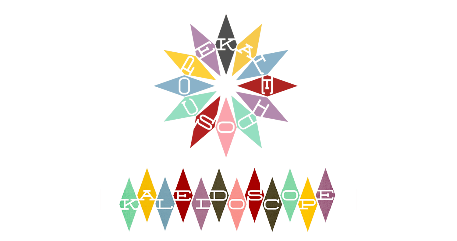
We landed on two versions of the logo.

The alternate radial version makes an appearance on the store's price tags.

We landed on two versions of the logo.
Kalelogos.png

Photos by the always amazing Christopher Semel.

 Photos by the always amazing  Christopher Semel .

The negative space logo is a uniquely "theatrical" icon.

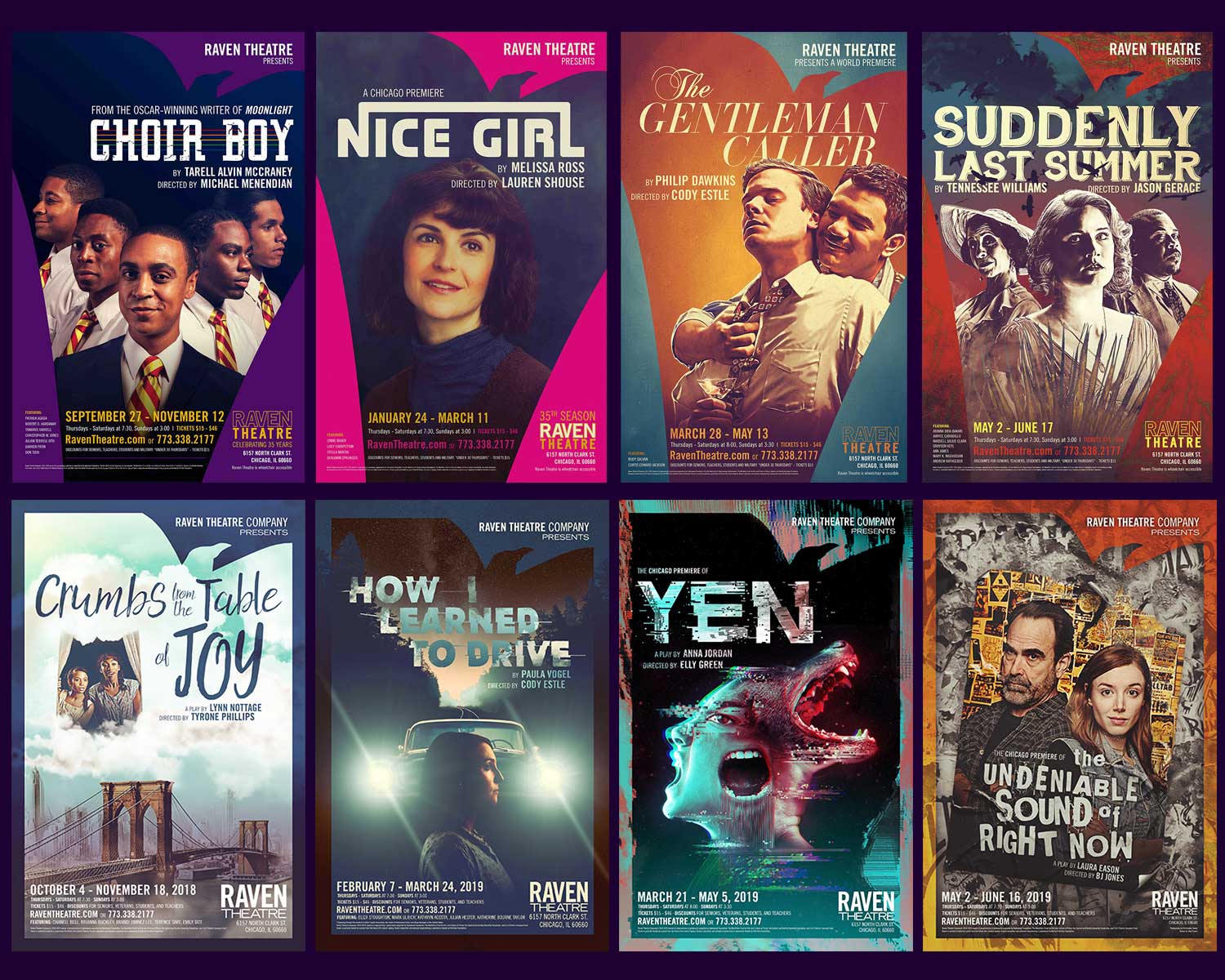
In our rebranding, the bird cutout became the frame of each poster, so that the “raven” is transformed by whatever occupies it. The same could be said for our stage.

The negative space logo is a uniquely "theatrical" icon.

Raven is primarily known for producing American classics and period-specific family dramas.

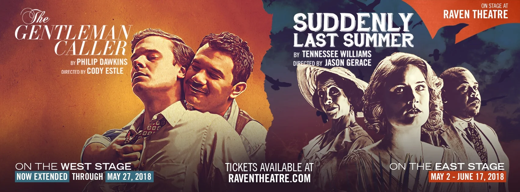
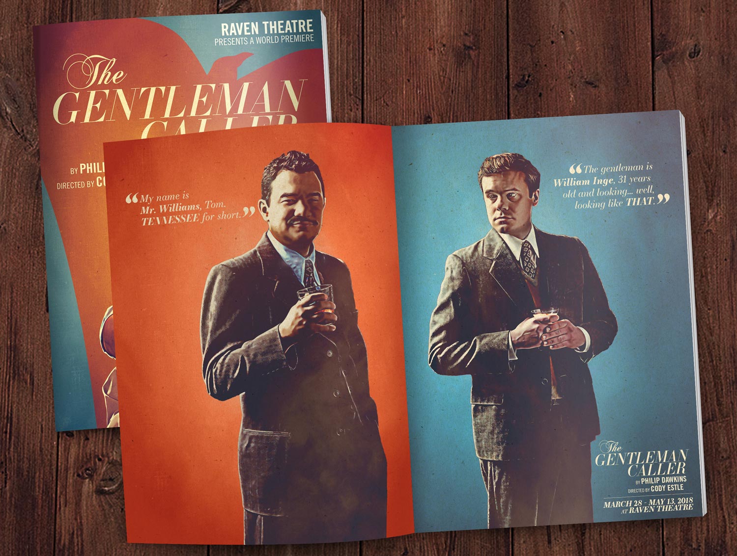
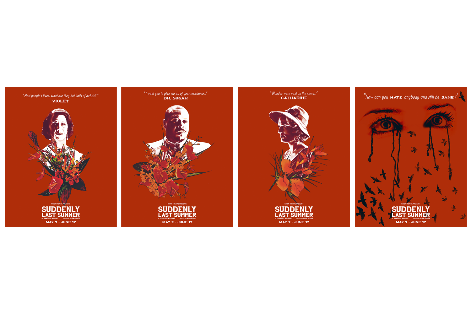
The final two productions of our 2017/2018 Season were a play about the early life of Tennessee Williams (The Gentleman Caller) and a classic thriller (Suddenly Last Summer) by the man himself. I was instructed to unify the visuals as much as possible, so I based the designs on hand-painted midcentury movie posters.

Raven is primarily known for producing American classics and period-specific family dramas.

For each production, I create individual character portraits.

It’s a great way to slowly introduce the world of the play while featuring actors and snippets of text. Here are two examples…

For each production, I create individual character portraits.

Most of the artwork begins with photography by my friend and partner, Christopher Semel

The Gentleman Caller portraits were painted over to resemble a vintage centerfold advertisement, while the Suddenly Last Summer portraits were based on old psychological horror film posters.

Most of the artwork begins with photography by my friend and partner, Christopher Semel

Of course, my work requires a lot more than pretty poster design.

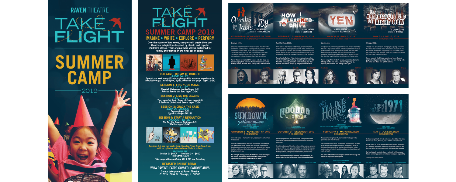
Here’s a peek at some of the promotional literature I’ve made for our subscription season and summer camps.

Of course, my work requires a lot more than pretty poster design.

There's a lot more to see!

You can view more Raven artwork on my Wall Paper page, or by visiting Raven’s website.

There's a lot more to see!

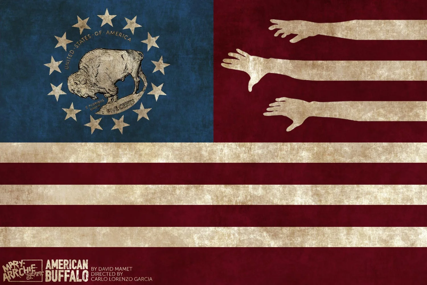
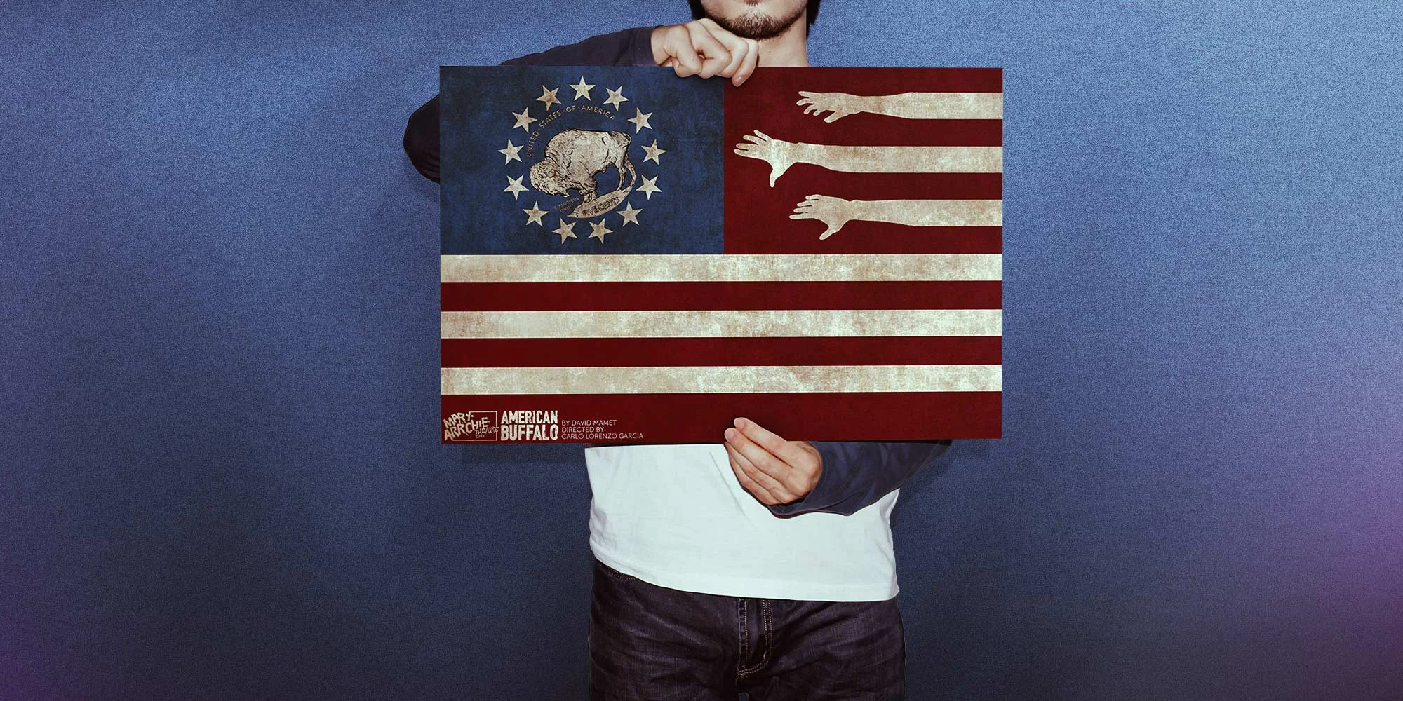
The company felt that the play was a perfect encapsulation of their work, and they wanted a "grand gesture" to accompany their final production.

Using a replica of an old Buffalo Nickel, I cut-out the image, and found a new home for it among the stars and bars. The result was simple, but effective.

The company felt that the play was a perfect encapsulation of their work, and they wanted a "grand gesture" to accompany their final production.

"In the 40 years since American Buffalo was first produced, I have not seen a better visual representation of this play."

- Albert Williams, Chicago Reader

"In the 40 years since American Buffalo was first produced, I have not seen a better visual representation of this play."

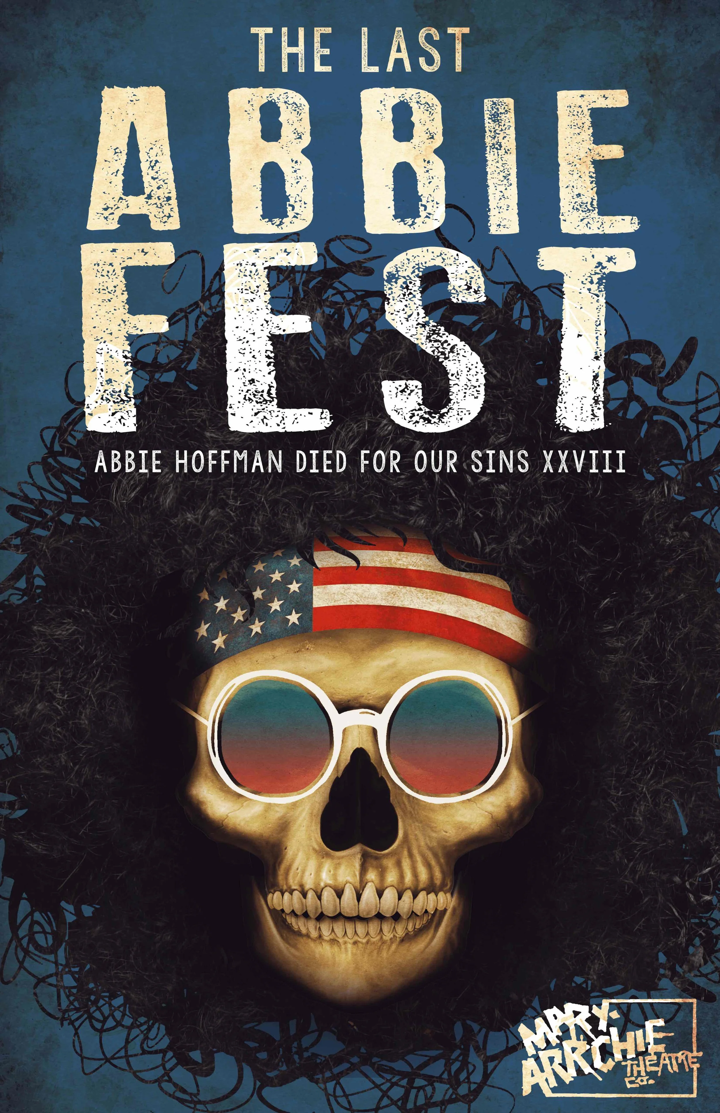
Every summer for 30 years, Mary-Arrchie also produced the "Abbie Hoffman Died for Our Sins" Play Festival, a 72-hour non-stop fringe theatre extravaganza.

Early “Abbie Fests” featured unknown young actors like Nick Offerman and Michael Shannon, and grew to include hundreds of artists and itinerant companies performing over 250 pieces of work in a single weekend.

Every summer for 30 years, Mary-Arrchie also produced the "Abbie Hoffman Died for Our Sins" Play Festival, a 72-hour non-stop fringe theatre extravaganza.

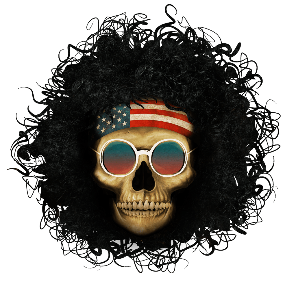
The skull of Abbie Hoffman seemed like the proper symbol for the end of this era in Chicago theatre.

Previous "Abbie Fest" posters were simple, utilizing a hand-drawn caricature of the famous "Yippie." For this final incarnation, we wanted something that would reflect the weight of the moment.

The skull of Abbie Hoffman seemed like the proper symbol for the end of this era in Chicago theatre.

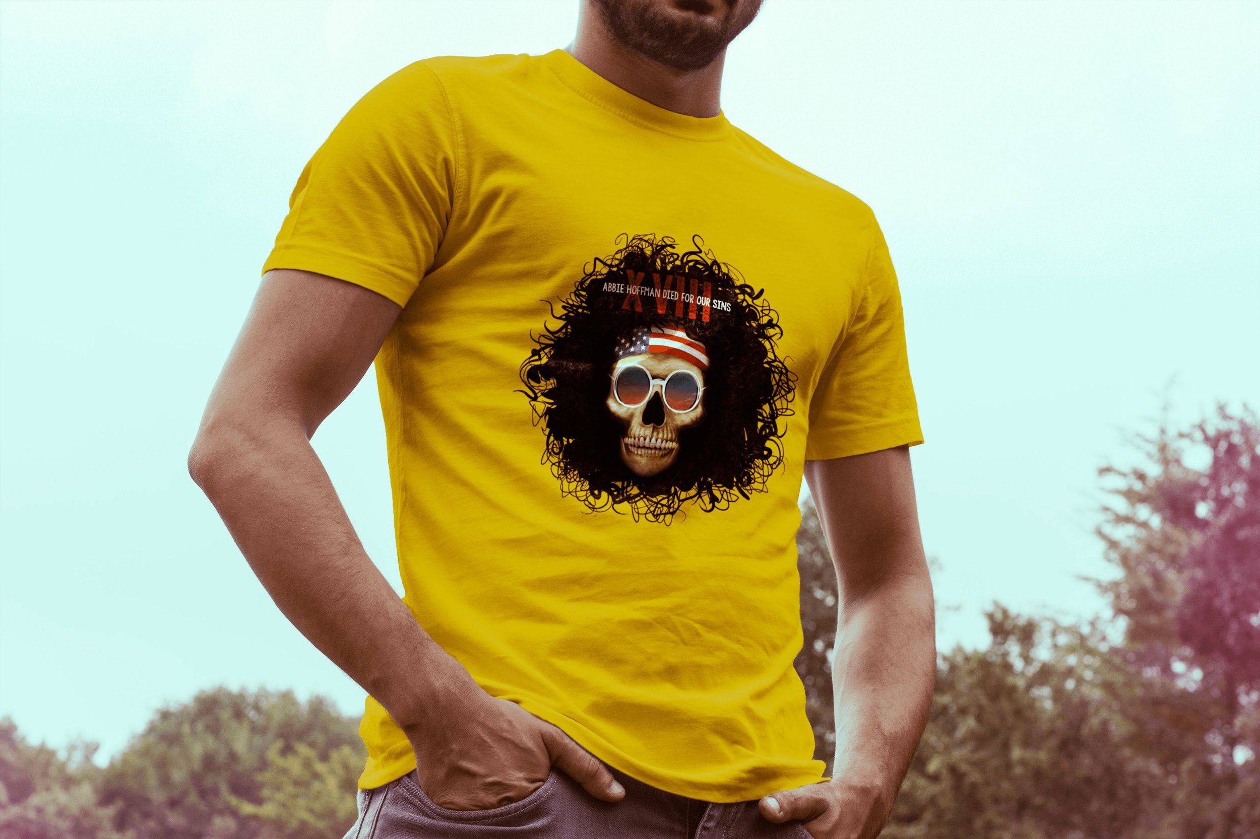
We even made shirts. Rest easy, Mary.

 We even made shirts. Rest easy, Mary.

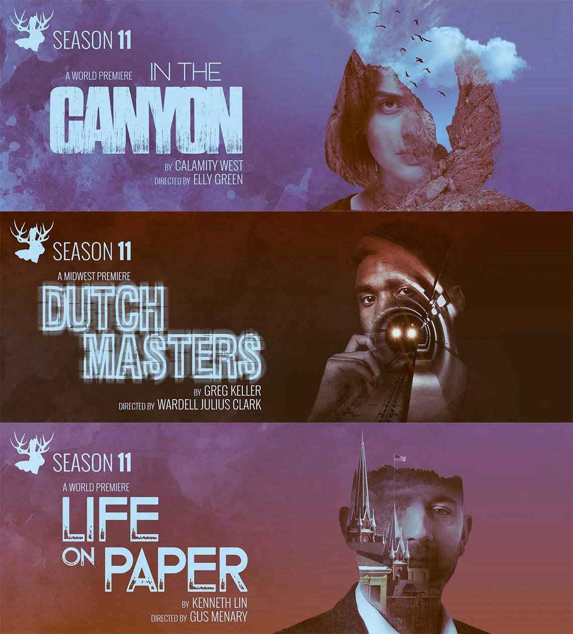
Like previous announcements, I worked with the playwrights and directors to create simple images that reflected each play's core message.

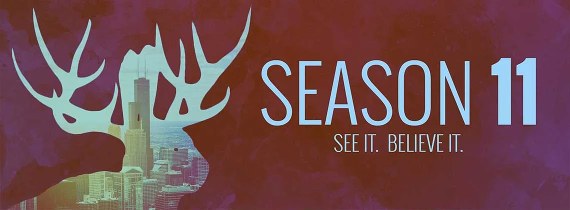
As the unifying concept, I created double-exposure images that mixed a face with the “landscape” of each play.

Like previous announcements, I worked with the playwrights and directors to create simple images that reflected each play's core message.

These gestural images are always a great jumping-off point for the development of the production art.

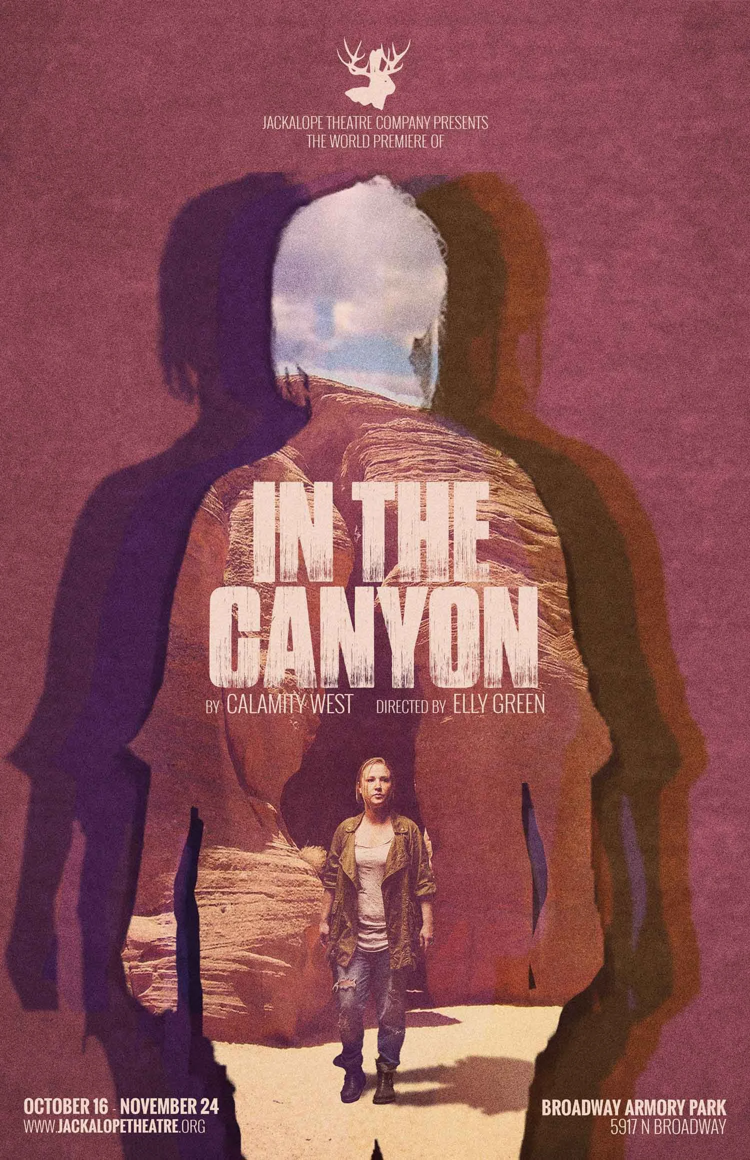
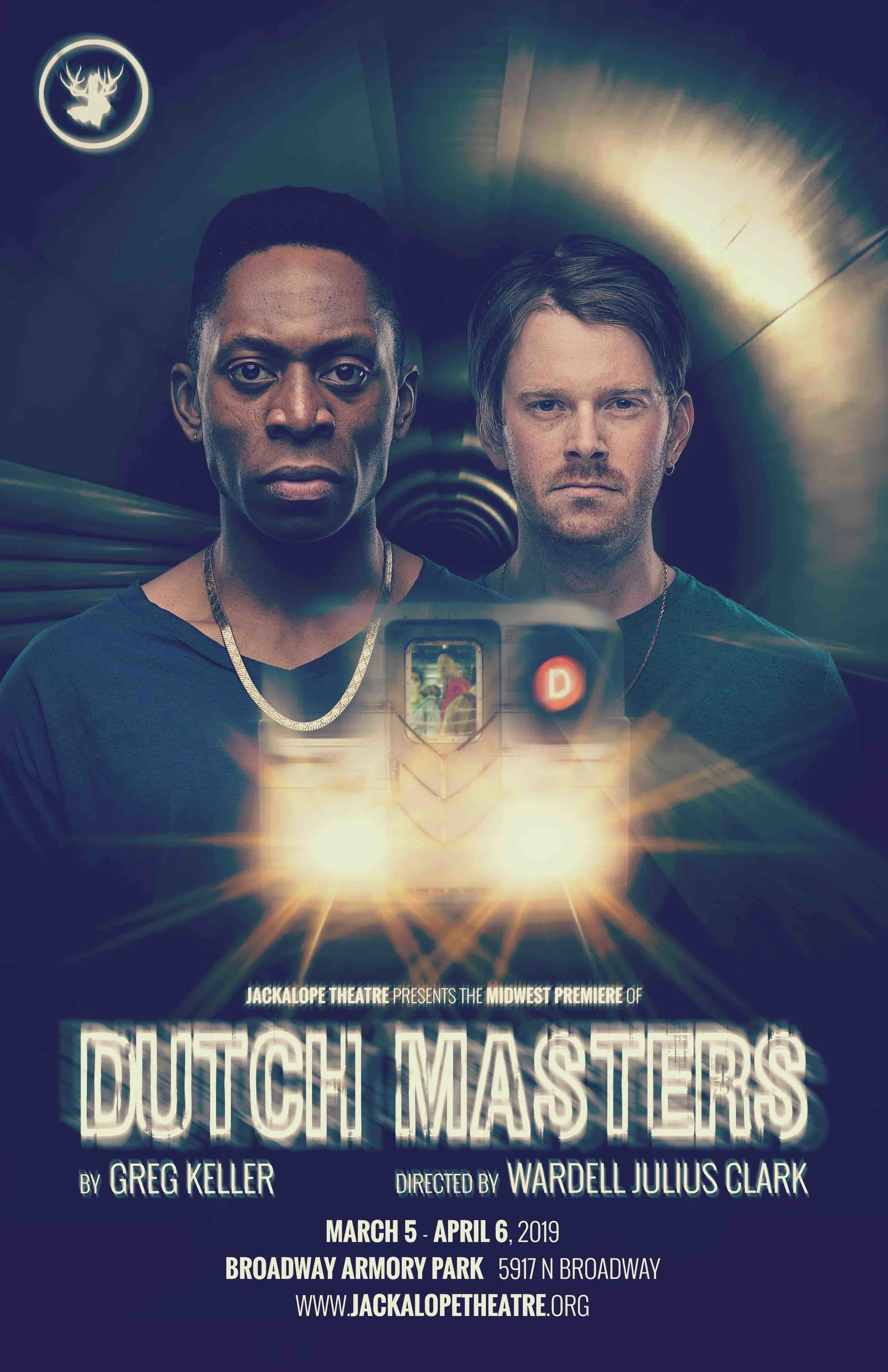
The double-exposure concept has carried through in unique ways that remain true to the production.

Scroll down to see how the images evolved into their respective posters!

These gestural images are always a great jumping-off point for the development of the production art.

In the Canyon: A play about the attack on Roe v. Wade, set in a dystopian future.

In the Canyon: A play about the attack on Roe v. Wade, set in a dystopian future.

Dutch Masters: Two strangers discuss race, history, and privilege on the D-train in 1992 Manhattan.

Dutch Masters: Two strangers discuss race, history, and privilege on the D-train in 1992 Manhattan.

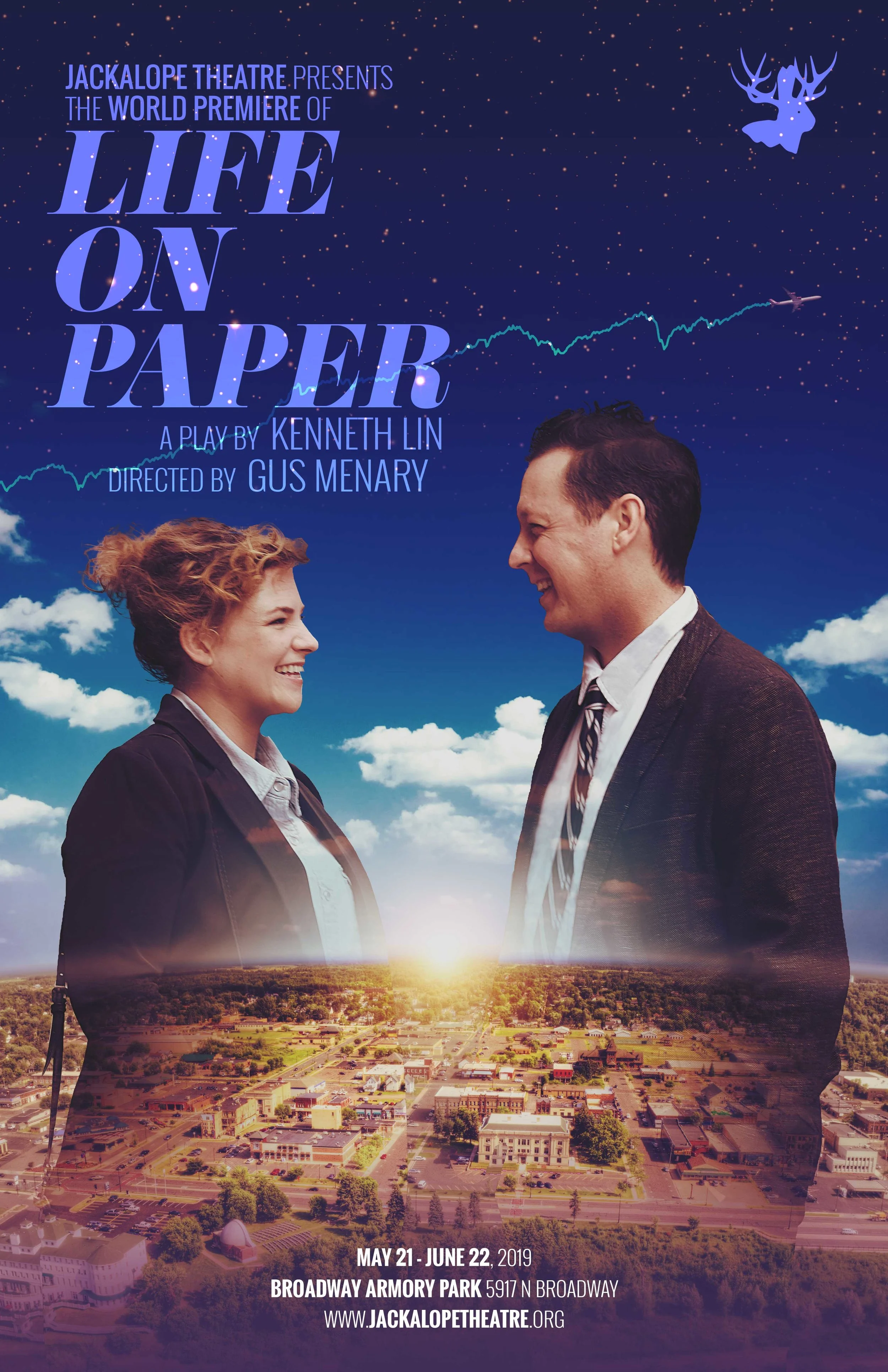
Life on Paper: a modern rom-com about love, death, and finance set in small town America

Life on Paper: a modern rom-com about love, death, and finance set in small town America

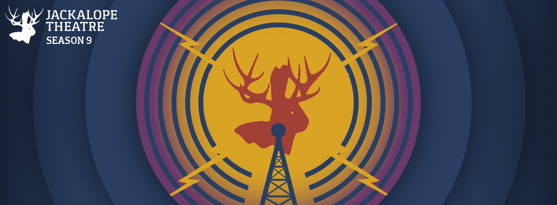
Jackalope has made an enormous impact on Chicago theatre in just a few years.

Given their mission of "expanding American identity," radio signals felt like a perfect encapsulation of their own rapid expansion and the strength of their influence.

Jackalope has made an enormous impact on Chicago theatre in just a few years.
Octagon.png
Snare.png

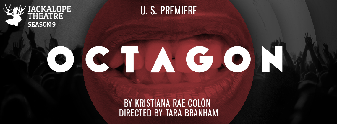
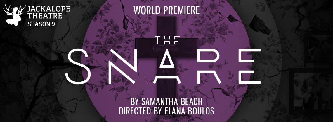
Each banner eventually blossomed into a full production image.

The themes we introduced in the announcement remained central in the final products. Scroll down to see the results!

Each banner eventually blossomed into a full production image.

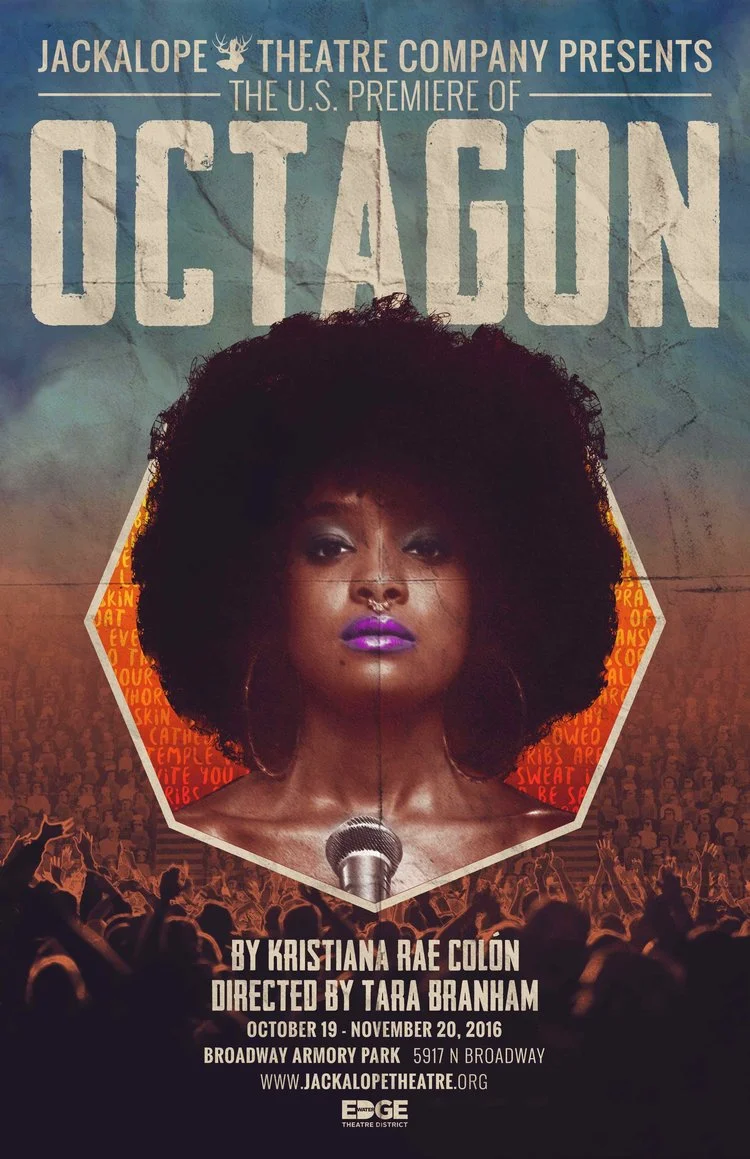
Octagon: a story about the rowdy and inspiring world of slam poetry.

Octagon: a story about the rowdy and inspiring world of slam poetry.

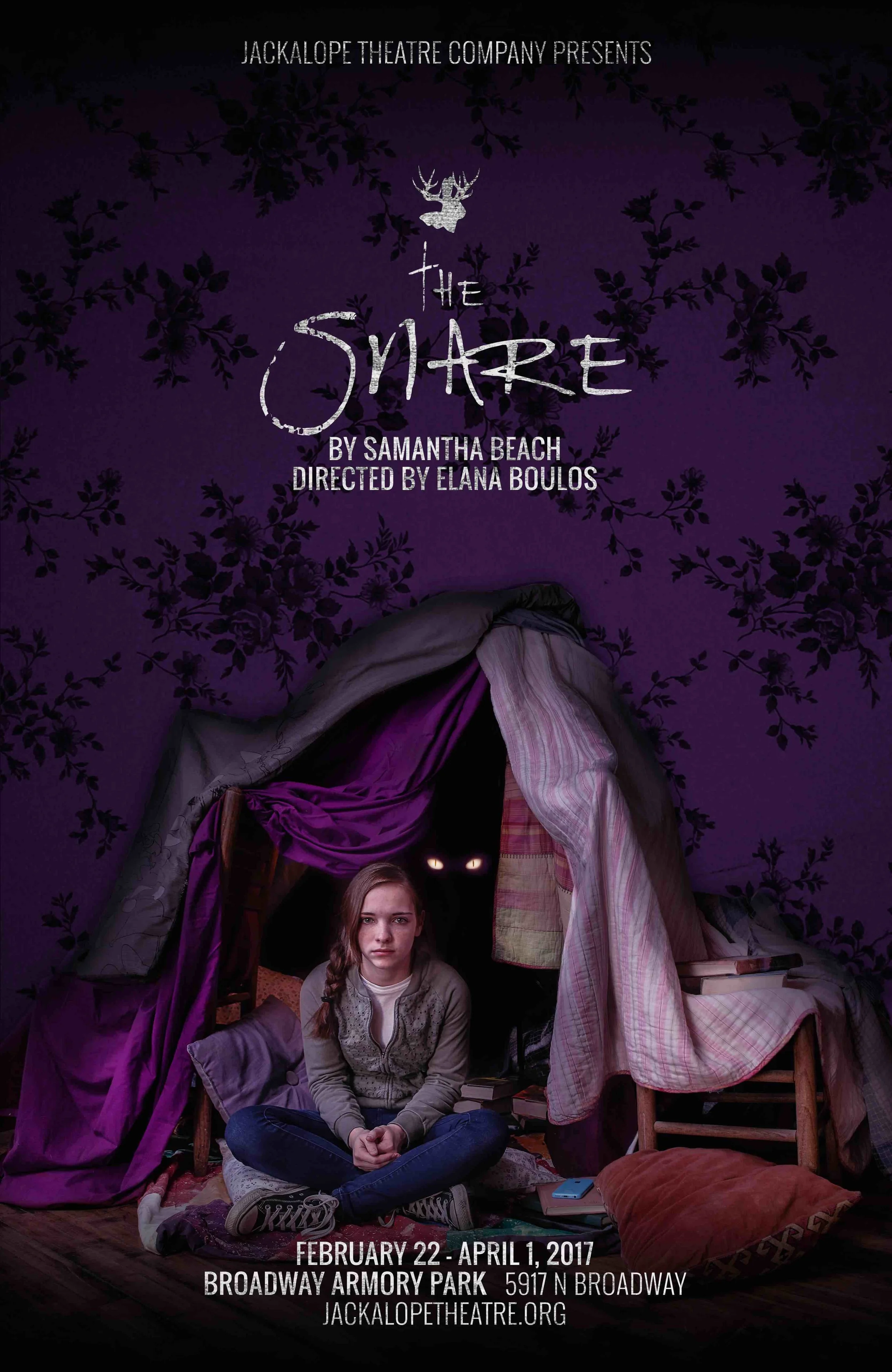
The Snare: a small-town family drama about demonically possessed daughter.

The Snare: a small-town family drama about demonically possessed daughter.

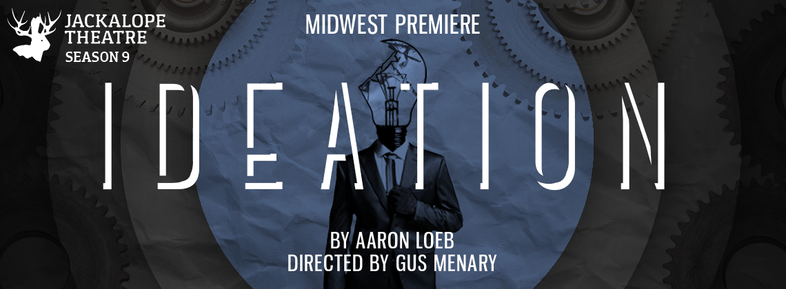
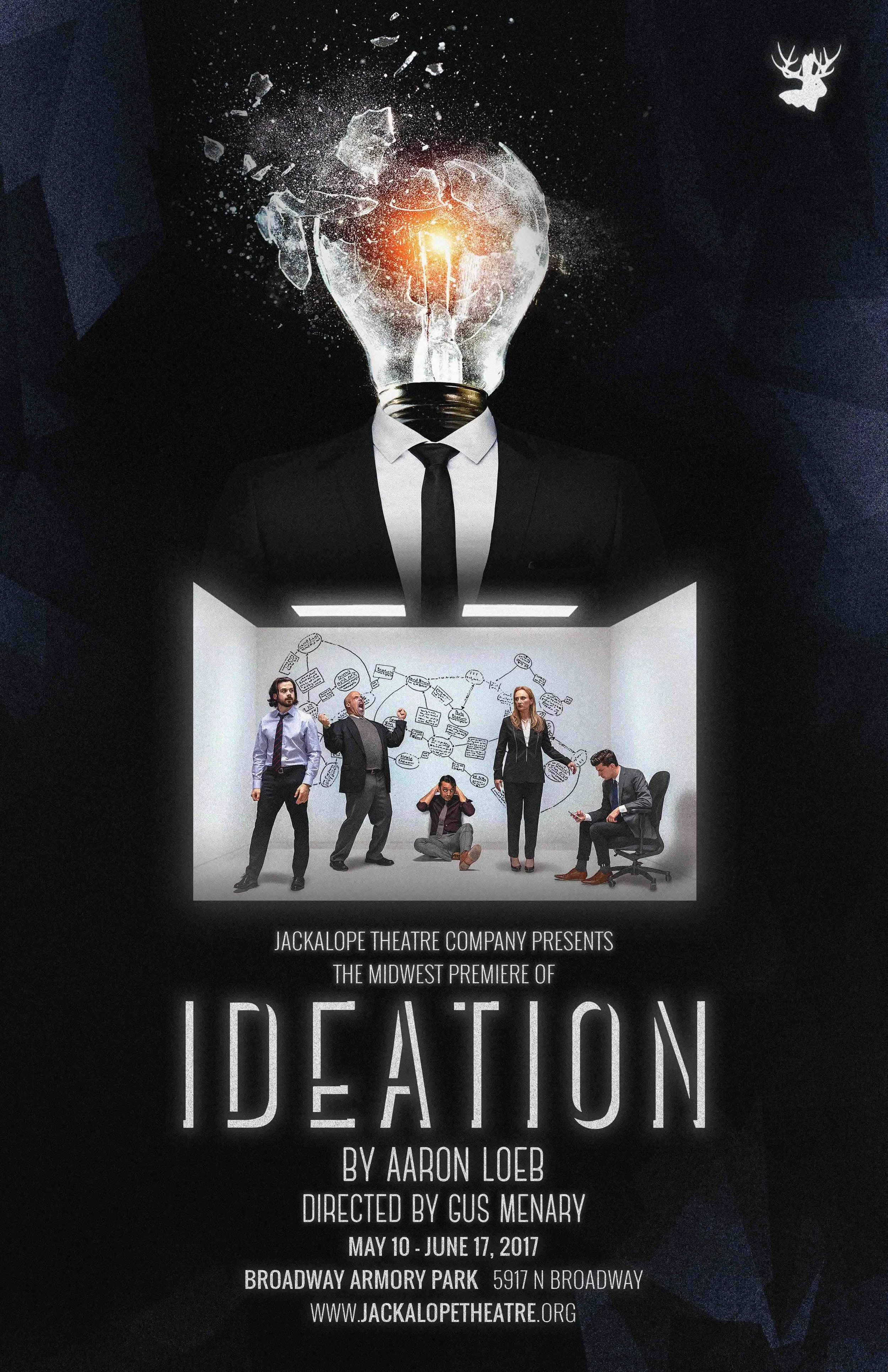
Ideation: a thrilling psychological drama about the end of the world through the eyes of corporate America.

All three posters featured photography by Joel Maisonet.

Ideation: a thrilling psychological drama about the end of the world through the eyes of corporate America.

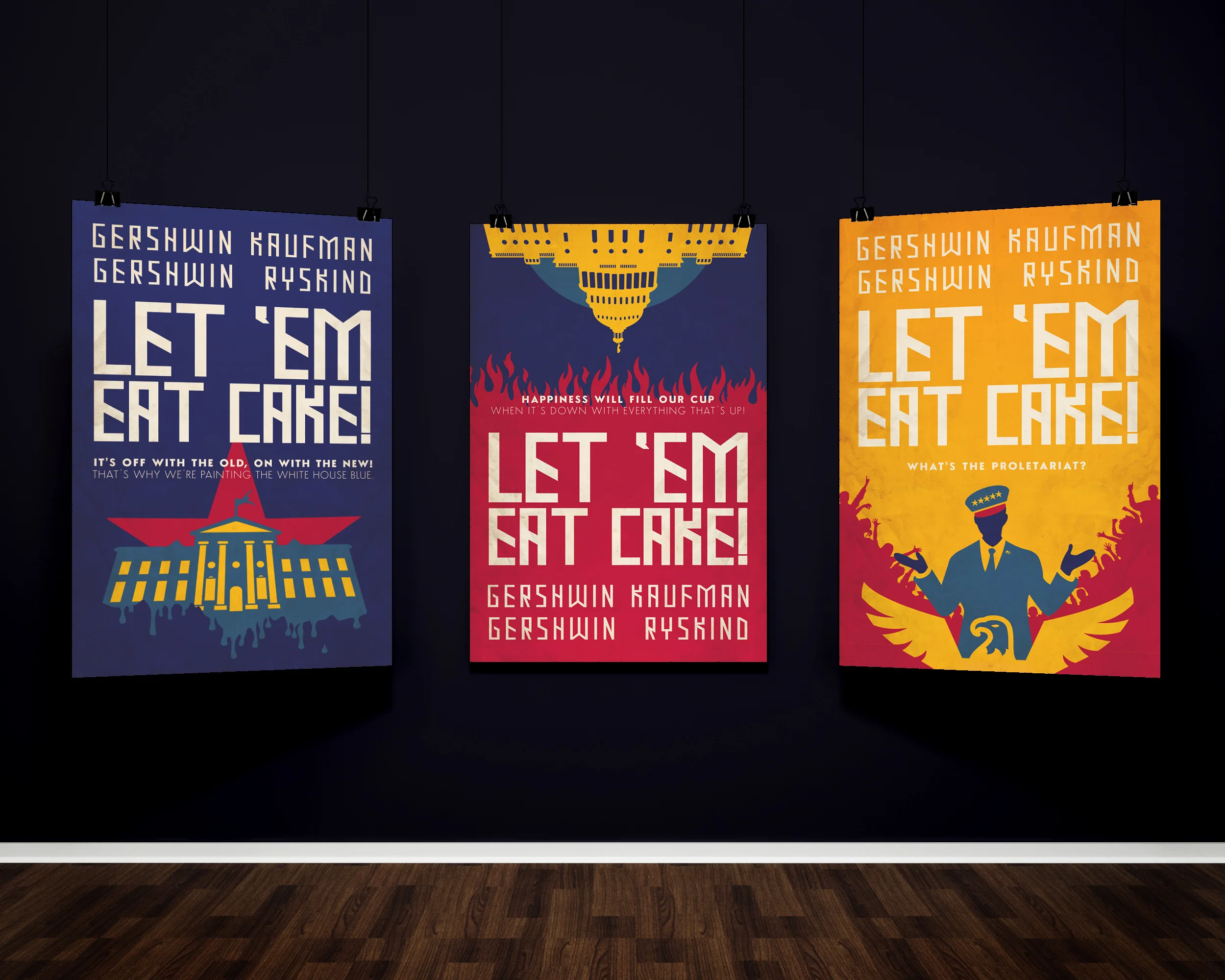
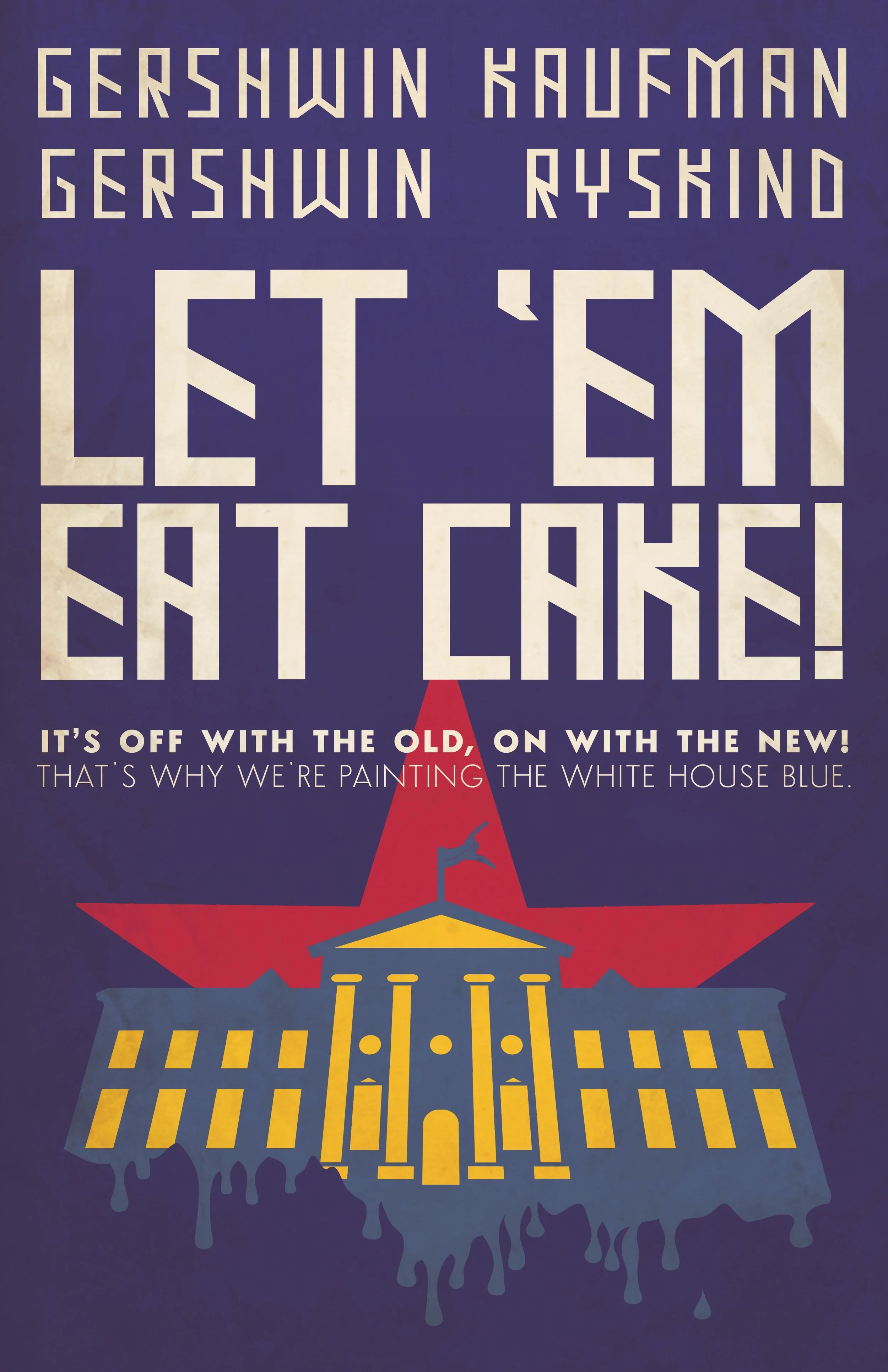
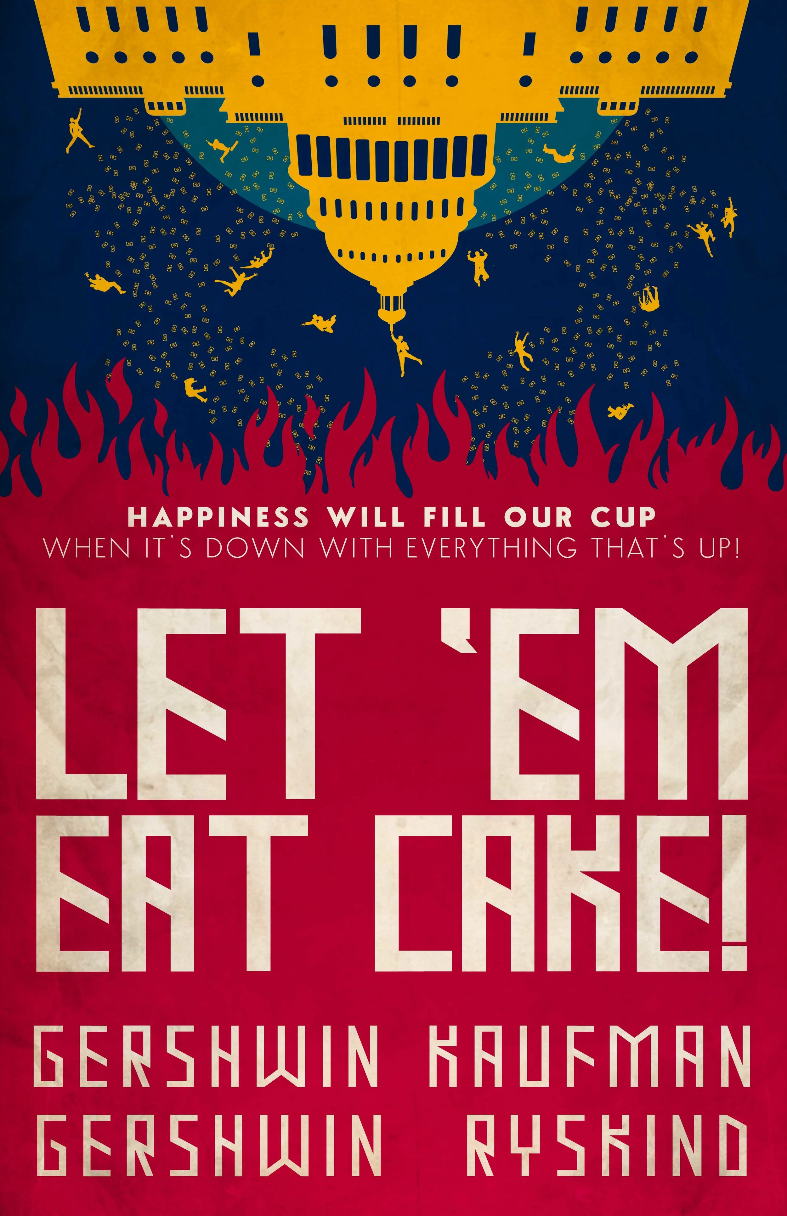
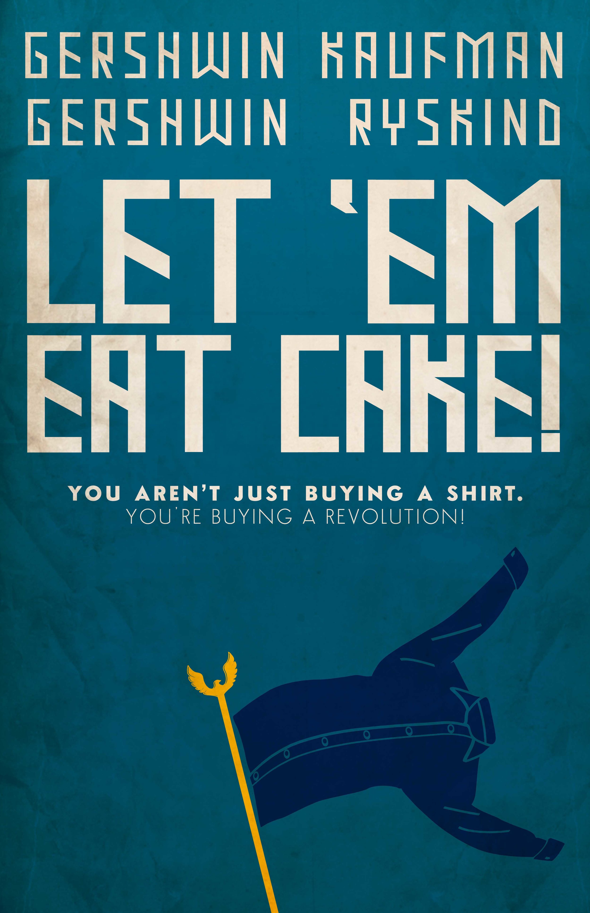
Lyrics plucked from the show provide the inspiration for each image.

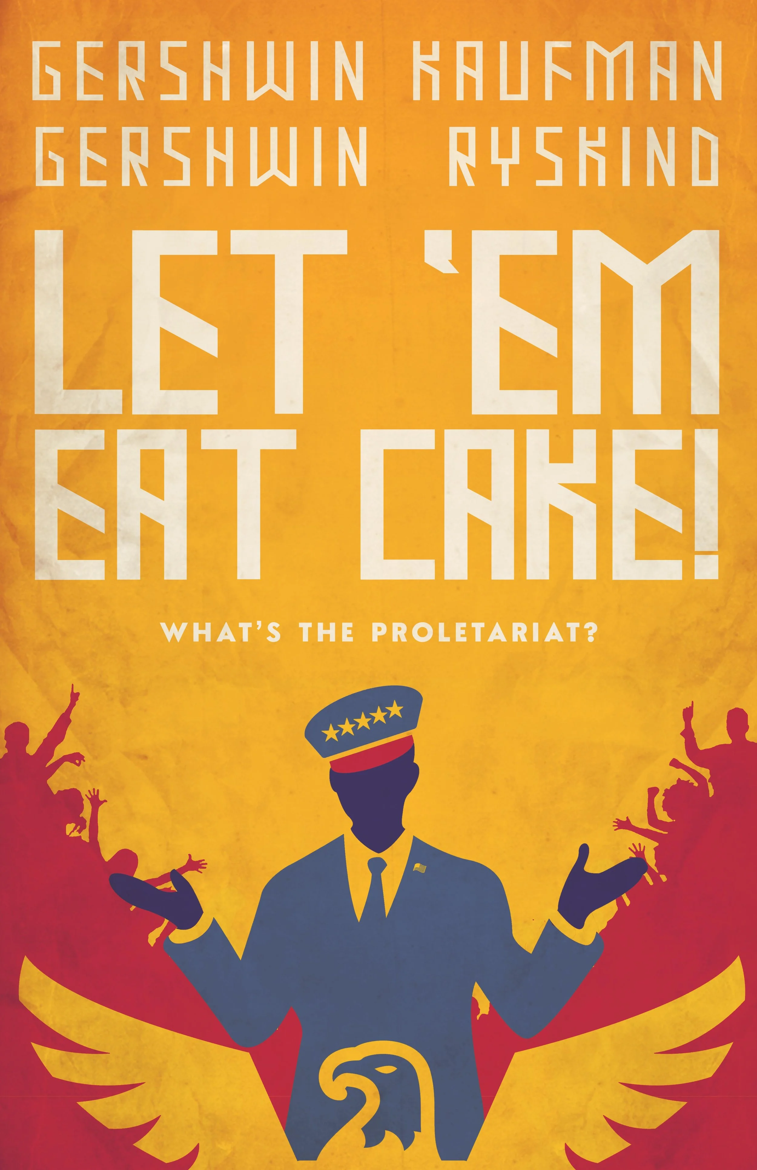
Like the play, I wanted to strike a caustic mix of American exceptionalism and fascist propaganda.

A little whimsy + a little terror.

Lyrics plucked from the show provide the inspiration for each image.
On With The New.jpg
cake3.jpg
cake4.jpg

Just a little passion project and a weird piece of history.

 Just a little passion project and a weird piece of history.

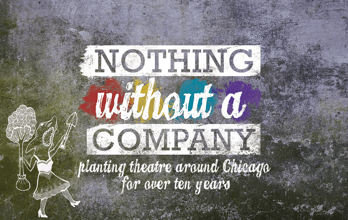
They requested a new logo that captured the immersive quality of their work, while paying homage to their ensemble of LGBTQ artists and, of course, their home town. Plus, the logo needed to fit with NWaC's long-time "Shark Lady" mascot. A tall order, to say the least.

 They requested a new logo that captured the immersive quality of their work, while paying homage to their ensemble of LGBTQ artists and, of course, their home town. Plus, the logo needed to fit with NWaC's long-time "Shark Lady" mascot. A tall order

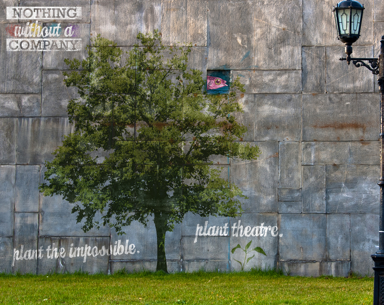
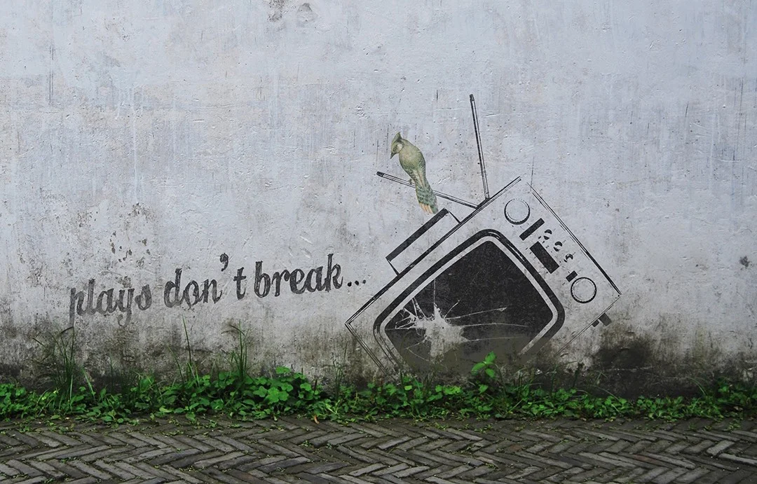
When talking about NWaC’s "immersive and revolutionary acts of art," the first thing that sprung to mind was street art. We wanted eye-catching, transcendent images tucked within the real world - the essence of immersive theatre.

 When talking about NWaC’s "immersive and revolutionary acts of art," the first thing that sprung to mind was street art. We wanted eye-catching, transcendent images tucked within the real world - the essence of immersive theatre.

I took inspiration from the Chicago and LGBT Pride flags to create the new NWaC logo.

I took inspiration from the Chicago and LGBT Pride flags to create the new NWaC logo.
nwac logos.png
nwac-break.jpg

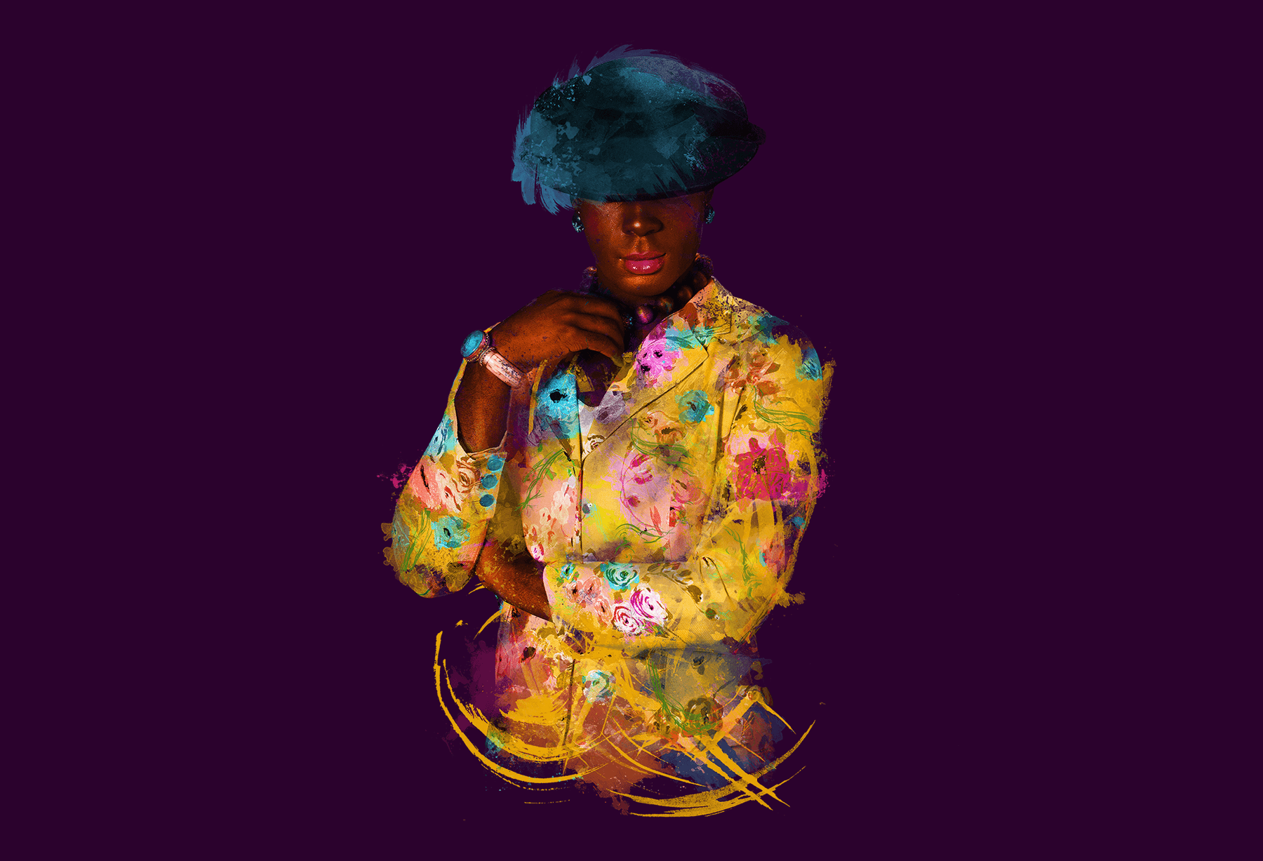
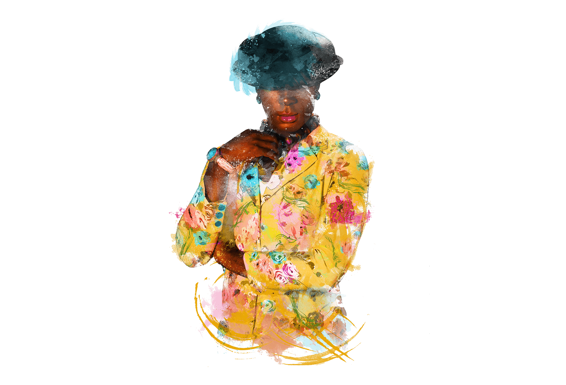
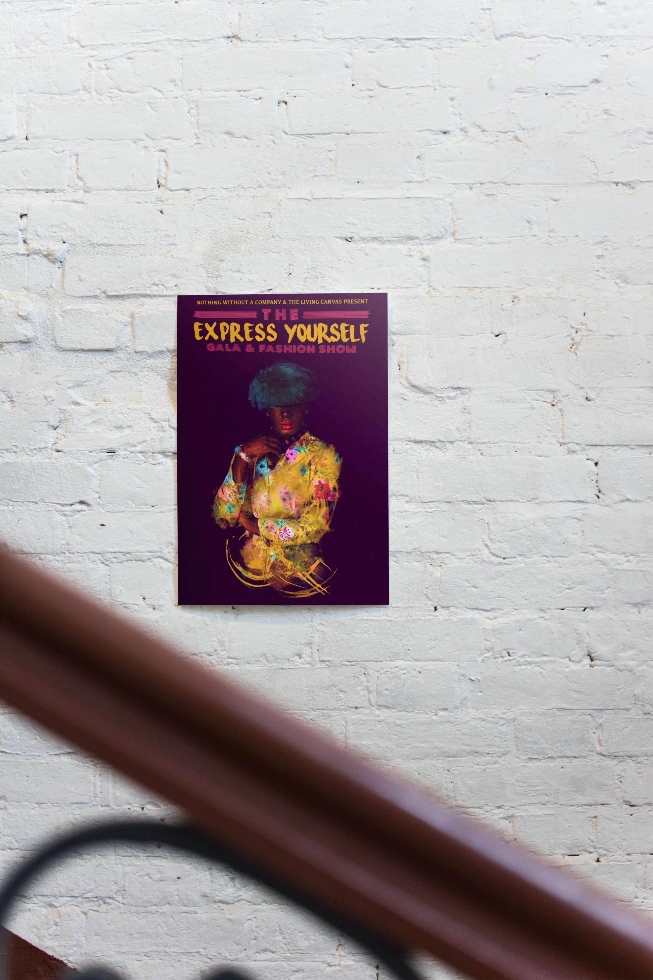
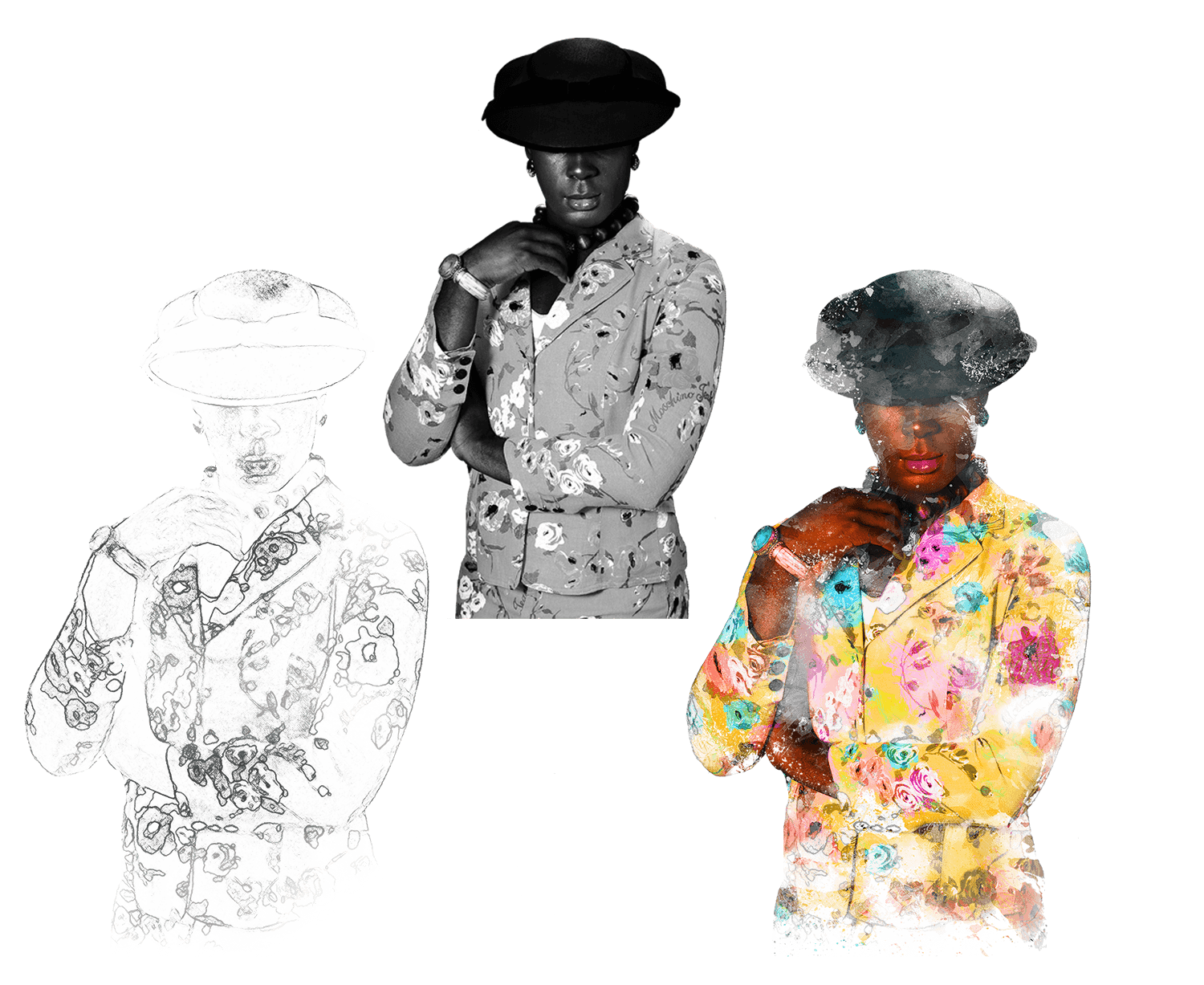
Darling showed up wearing the greatest floral jacket imaginable.

Using the photos, I created a digital outline highlighting some key details, then brought her to life with some brush strokes.

Darling showed up wearing the greatest floral jacket imaginable.

All the fun of a watercolor effect without the mess.

Wanting to stay true to NWaC's hand-made street art aesthetic, I introduced some splashy finishing touches, and the deed was done!
All the fun of a watercolor effect without the mess.
Full Transparent.png
darling mock.jpg
Kaleidoscope Vintage + Ephemera
Raven Theatre
Mary-Arrchie Theatre
Jackalope Theatre (2018)
Jackalope Theatre (2016)
Let 'Em Eat Cake!
Nothing Without a Company
Express Yourself
New Page

POWERED BY SQUARESPACE